Friday, April 27, 2012

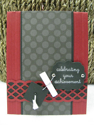
Celebrate Your Achievement - PPC92

This card is for The Paper Players Challenge #92, a sketch challenge.
I was going for a more masculine graduation card for this one.  Our school colors are red, black and white so I chose to go that route.  I rolled up a little scrap of copy paper, tied it with some silver cord and voila!  A diploma.  Next, I punched a 1/2" square, fashioned a tassle out of some white string, added a brad and I had myself a graduation cap. 

Stamp: Close To My Heart
Paper: Cherry Cobbler, Black, DP from DCWV
Ink: VersaMark
Accessories: Square punch, border punch from EK Success, black mini brad, silver brads, silver EP, silver cord
Thanks for taking a peek!
Jenny
Monday, April 23, 2012

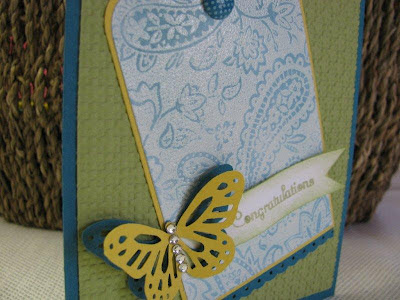
Ghosting Butterfly - FM55 & OCC

Today's card is a combo of the Friday Mashup 55 and Our Creative Corner
FM55 calls for using a sketch and the ghosting technique.  There is a link to the techniqe over at the Friday Mashup blog.  OCC's challenge was to use butterflies.  The inspiration picture showed butterflies in many colors, and I chose to use blue, green and yellow in the form of Island Indigo, Pear Pizzaz and Daffodil Delight.


Like I said in my last post, I'm concentrating on graduation cards, so this will go to my niece who is graduating from Jr. High in a few weeks.  I think its just sweet enough for a girl her age, plus she loves bright colors with her favorite being yellow.
Here's a list of supplies I used.....
Stamps: Paisly Backround, Tender Tags from CTMH
Paper: Island Indigo, Pear Pizzaz, Daffodil Delight, White
Ink: Craft White, Pear Pizzaz
Accessories: Martha Stewart butterfly punch, basic jewels, dotted scallop border punch, in color brad, daffodil 1/8" ribbon, corner rounder punch, scallop border punch, square lattice EF
Thanks for taking a peek!
Jenny

Sunday, April 22, 2012

Sophisticated Grad - FMS31

Graduation is right around the corner, so grad cards are number one on my list to make.  I'm the kind of stamper who does not like to mass produce (sometimes I might make two of one kind of card), so I need to get my creative juices flowing and get cracking. 
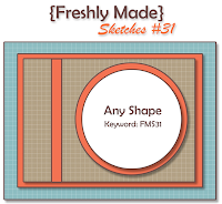
The starting point for this card was the Freshly Made Sketches #31 Challenge.  I flipped the sketch on it's side, because my shape fit a little better that way.
 
 I had the cream colored label already cut and sponged from my last project, so that was my second jumping off point.....things just emerged from there and before I knew it, this card was done!  It's a pretty straight forward design and doesn't have much for frills, but then again that's what you want in a masculine card, right? 
The backround paper is from the Mocha Morning Specialty DP and has a bronzy, shimmery, metalic sheen to it.
   Here's a list of supplies I used....
Stamps: Great Grads, Congrats
Paper: Soft Suede, Early Espresso, Vanilla, Mocha Morning DP
Ink: Early Espresso, Soft Suede (sponging)
Accessories: Adhesive pearls, Framelits Labels die, 1 3/4" Circle punch, Circles #2 die, border EF by Provo Craft
Thanks for taking a peek!
Jenny 
Friday, April 20, 2012

Faith Hope Love - CCMC198

I guess it's time to start gearing up for wedding season, so that's the theme I chose to go with for this card.  I used the sketch from Create with Connie and Mary Sketch Challenge 198.

2012 Create Challenges-016
I saw a card over at Mary Fish's blog that incorporated a flower like this and absolutely fell in love with it!  I knew I had to recreate one.  It uses the Blossom Petals Builder Punch.  If you hop over to her blog, she has all the instructions right there! 
The finished flower is big, so my card base measures 7" x 5". 
I wanted to keep the colors soft and pretty, but still fun and summery so I chose to use Soft Suede and cream for a bit of sophistication and popped some Calyso Coral in there for the fun!  The DP is from Mocha Morning Specialty Designer Paper collection.  This particular dotted pattern is the number one reason I purchased that DP set....I adore polkadots.  I embossed the plain piece of Soft Suede with my Finial Press EF, added a scallop punched border and topped it all with the main panel sentiment.  I cut two Framilits Labels, one slightly smaller than the other, layed the smaller one over the top of the larger one and sponged a border around the larger label.  A couple basic pearls to highlight the scripture verse and a touch of ribbon tie it all together.  But, the flower is really the star of the show right?!? 
Here's a list of the supplies....
Stamps: Elegant Inspirations
Paper: Soft Suede, Calypso Coral, Vanilla, Mocha Morning DP
Ink: Calypso Coral
Accessories: Blossom Petals Builder Punch, Framelits Labels Collection die, Eyelet Border punch, Finial Press EF, Latte button, Basic pearls, Calypso Coral organdy ribbon

Thursday, April 19, 2012

Shades of Gray Shadow

Today's card combines Retro Sketches 7 and Colour Q 133.
  I stamped the main image on Gray cardstock, in Basic Black ink, then went over it again, a little off-set this time, with White Craft ink.  This produces the shadowed effect.  I used a Martha Stewart punch on the bottom of the gray cardstock before adding the strip of scalloped dotted ribbon in black. I also rounded the corners of the top of the main panel for a little added interest.  For the backround panels, I stamped each one with my Distressed Dots backround inked with White Craft ink.  The card was finished off with the sentiment circle and a couple of layered butterflies to tie in the Mustard and Durango colors.
Here's a list of supplies I used......
Stamps: Just Believe, Distressed Dots, Thinking of You (Michaels)
Paper: Black, Gray, Dusty Durango, More Mustard, White
Ink: Black, White Craft, Dusty Durango, More Mustard
Accessories: Embosslits Butterflies, 1 3/4" & 1 1/4" circle punches, Martha Stewart edge punch, Scalloped dotted ribbon, corner rounder punch, basic pearls
Thanks for taking a peek!
Jenny

Wednesday, April 18, 2012

Triple Threat Number Two!


The JUGS Technique Challenge was to create a layer using the "sponge a layer" technique. If you hop over to their website there's a link for a "how to" on this technique.

I decided to use the Mojo Monday Sketch 237 again, because I thought it matched up well with the sponging layer technique. I also incorporated the colors of Kermit (green, pink and red) from Friday Mashup 54. I know the colors aren't bright like Kermit, but they are in the color family! I had so much fun creating this combo challenge card!


Stamps: Fabulous Florets, Faith In Nature
Paper: Vanilla
Ink: Pretty in Pink, Cerry Cobbler, Always Artichoke
Accessories: Artichoke seam binding ribbon, designer button, pretty in pink 1/8" ribbon, Artichoke brads
Thanks for taking a peek!
Jenny

Triple Threat Circus Train!

Multitasking is the word for today!

This card is for The Paper Players #91 (CAS watercoloring), The Friday Mashup #54 (Muppet colors + a kids card), and Mojo Monday Sketch Challenge 237

For the Friday Mashup part, I chose to use the colors of the muppet Gonzo and then chose this fun, old Circus Train stamp set to go with it.  I watercolored the train cars (which incorporates The Paper Players challenge) after I used my Stamp-a-ma-jig to position them.  I embossed the train using black EP.
 I used the Mojo Monday sketch and interpreted it a little "loosely".  I didn't use four seperate circles, but I did use four separate images. :)
I kept it fairly simple (again for The Paper Players), just adding a couple borders to the main image and enhancing the sentiment a bit by popping up the word BEST with a pop-dot.
Stamps: Circus Train, Perfect Words
Paper: Island Indigo, Real Red, Crushed Curry, White
Ink: VersaMark
Accessories: watercolor pencils, Blender Pen, Scallop Border punch, Dotted Scallop Border punch
Thanks for taking a peek!
Jenny 

Saturday, April 7, 2012

Bright Ribbon Baby - FM53

It's tic tac toe time over at The Friday Mashup again!  I love these sorts of challenges because we have so many choices. This was perfect for me this week because I needed a baby card for a sweet mom-to-be who doesn't know the sex of the baby yet.  So, my card needs to be gender neutral.  I've been kicking this rainbow ribbon idea around for a while now and figured this might just be the challenge to bust it out on.  I love all the fun, bright colors.
I adhered the Welcome Baby sentiment with dimensionals after I punch it out with the Modern Label punch.  I decided to color the sentiment rainbow style to go with the ribbon.
Stamp: Welcome Baby
Paper: White, Daffodil Delight
Ink: Real Red, Pumpkin Pie, Daffodil Delight, Old Olive, Pacific Point, Rich Razzleberry
Accessories: Assorted ribbons and buttons, Cuttlebug Swirls EF, Modern Label punch
Thanks for taking a peek!
Jenny
 

Wednesday, April 4, 2012

Punny Cow - PP89 & C4C130

This weeks challenge over at The Paper Players was to create a card to "Tickle your Funny Bone".  The stamp set I chose to use is called Howdy from Close To My Heart.  I also used the Sketch from Crazy 4 Challenges #130.
 

I love the saying that is inside the card too....
Stamps: Howdy (CTMH)
Paper: Black, White, Tempting Torquoise, Pawsativly Prints DP
Ink: Stazon Black
Accessories: colored pencils, Scallop Dot ribbon, Floral Fusion die, Black pearl
Thanks for taking a peek!
Jenny

Tuesday, April 3, 2012

Burlap Birdie

This cute little birdie card was made for Our Creative Corner: How Green is Your Spring?  The challenge was to make a papercraft using green as a main color.  I purchased this sweet table runner from Hobby Lobby this spring, and it had me brimming with inspiration.  This challenge was perfect for this project!  Here's a pic of my inspiration piece....
I love how the wing of the bird is a leaf.  I used my Build A Blossom stamp set and punched a leaf/wing with the Build A Blossom punch.
Here's a closer look at the card.
Stamps: Build A Blossom
Paper: Soft Suede, Pear Pizzaz, Crumb Cake, So Saffron, Old Olive
Ink: Old Olive, Soft Suede, Daffodil Delight (sponging)
Accessories: Bird Builder punch, Build a Blossom punch, Little Leaves die, Itty Bitty Punch Pack, In Color buttons, twine, half pearls, Pear Pizzaz polly stitched ribbon, Square Lattice EF, Scallop Ribbon Border punch, Label 3 die from Nestabilities
Thanks for taking a peek!
Jenny
 

Sunday, April 1, 2012

Retro Playdate - PDCC125 & RS5

Today's card is for two challenges again.  The Play Date Cafe Challenge 125 using black, white, and brown.  Black and brown really do go together!!  I actually really like it and may even have to try it with my wardrobe.  I will definately be using this color combo again in the future.  It gives such a vintage feel.  The other challenge I used for this card is Retro Sketches 5.
This sentiment I used is from a set called Card Chatter-Birthday, made by Close To My Heart.  I love how the font matches the vintage style of the card. This is actually the first time that stamp has seen any ink!

Here's a list of supplies......
Stamps: Daring Adventure, Card Chatter-Birthday (CTMH)
Paper: Black, Vanilla, Chocolate Chip, Newsprint DP
Ink: Early Esspresso, Black
Accessories: Buttons, Bakers Twine Black, Square Lattice EF, Brown 1/2 pearls
Thanks for taking a peek!
Jenny