Monday, January 28, 2013

Neutral Thoughts


I needed a quick sympathy card today, and here it is.  I searched around for sketch inspiration and came up with The Paper Players 130.

I started off with scraps that were on my desk....again!  The Crumb Cake background paper was used on my last project, as well as part of the main image.  For the card in my last post, I cut out the center "heartfelt" piece from the Layered Labels set.  For this card I used the outside of the stamped piece, sponged it with some Crumb Cake, and layered it over a vanilla scrap I stamped with the "Your In My Thoughts" sentiment.  I popped it up with dimensionals to give it some extra interest.


I thought there was space that needed to be filled in under the sentiment, so I grabbed the new Designer Builder Brads and some linen thread.  


In my last post, which was for the Dynamic Duos color challenge, I mentioned that I had a hard time putting together a card with the neutral challenge colors.  Today, with basicly the same color scheme, it came together in a snap.  It's funny how some things work out!

Here's a list of my supplies.....
Stamps: Layered Labels, Word Play
Paper: Early Espresso, Vanilla, Print Poetry DP
Ink: Crumb Cake, Soft Suede, Early Espresso
Accessories: Designer Builder Brad, Linen Tread, Oval Famelits

Thanks for taking a peek!
Jenny


Saturday, January 26, 2013

Monochromatic ~ DD37


It's Dynamic Duos Saturday and this week is our Monochromatic Challenge!  This week's colors are Soft Suede and Crumb Cake.  
Now, normally I'm all over colors like this.  This week I had a mental block for some reason.  I searched and searched for inspiration.  I've actually used this color combo several times in the past.  I actually started by punching out a bunch of hearts out of scrap cardstock, temporarily glued them to a piece of Soft Suede and sprayed the whole thing with my Shimmer Spritz spray.  It was pretty, but still no real good ideas as of what to do with it.  Then, my box of goodies Stampin' Up goodies arrived......
I ended up using a bunch of new supplies like the Honeycomb EF, Paper Doily, Vanilla Flower Trim, Oval Framelits, and Print Poetry DP.  Once I had all my supplies figured out, I searched for a sketch to use.  I found Try Stampin On Tuesday #102.  Super!  It was a match made in heaven!  Once I got it all figured out, the card came together in a snap!  What about the Shimmer Spritzed Soft Suede piece, you ask?  Well, I trimmed it down and used it as the center background piece.  You have to look real close to tell that there are hearts on it (they ended up mostly covered up).   


I'm really in love with the Flower Trim, especially when I saw others cutting the flowers off the strip and dying them with regular ink!  That's what I did here.  I just pressed the flower into my Crumb Cake ink and this is what resulted!  My flower was colored on mostly just the tips, but it you want your flower totally saturated with color, mist it with water.  This will allow the ink to penetrate further into the fabric and create a solid colored flower.  I'm anxious to display that technique on future cards!


The paper doilies are stark white, so I sponged some Crumb Cake onto this one to soften it up some.
Make sure you visit the other Dynamic Duo Dynamo's blogs for tons more inspiration!

Here's a list of supplies I used....
stamps: Layered Labels
paper: Soft Suede, Crumb Cake, Vanilla, Print Poetry DP
ink: Soft Suede, Crumb Cake
accessories: Vanilla Flower Trim, Oval Framelits, Paper Doily, Honeycomb EF, Shimmer Spritz, Pearls, Lace Ribbon Border punch, Three Heart punch, Distress tool

Thanks for taking a peek and have a wonderful day!
Jenny


Monday, January 21, 2013

Triple Challenge in White


Oh, how I love a card that multi-tasks!  This one is for three different challenges.  Our Creative Corner challenge was to make an entirely white card with decorative edges.  Merry Monday #46 said to make a Christmas card using a bird.  And the last challenge is the sketch from Retro Sketches #47.
I started by trimming the right edge of the card with my Scallop Eyelet Border punch.  Then I ran a piece of white through the Big Shot with my Vintage Wallpaper EF.  I rolled my brayer through some Illuminate ink and lightly rolled it onto the embossed panel.  It gave the raised part a little glimmer and shine.  I punched the bird out with my Bird Builder punch, spritzed the body with shimmer spray and inked the wing with more Illuminate ink.  Next, I cut out the swirl and "Peace" with decorative strip dies.  The swirls got yet more Illuminate ink and the "Peace" was embossed with Iridescent Ice EP.  The last thing was to add a strip of Silver Glimmer paper and some more Scalloped Border punched pieces to the top and bottom of the main panel.  I love the way this turned out...I've always been a sucker for an all white card!


Thanks for taking a peek!
Jenny


Saturday, January 19, 2013

NAC29 & S.A.2


This card is for the new challenge blog Still AddINKtive.  Challenge #2 combines a sketch and color combo.  I also incorporated the sketch from Nacho Average Challenge #29.
Nac29

I started with a square of Very Vanilla cardstock and sponged half with Tempting Torquoise and half with Summer Starfruit.  Then I stamped the foliage in Chocolate Chip ink.  I layered the square onto a piece of Chocolate Chip and then a scrap of Tempting Turquoise that I cut with my scalloped square duo die.  For the background, I stamped a medallion in Chocolate Chip, then ran the whole thing through my Big Shot in the Script EF.  I layered that on a piece of Summer Starfruit after rounding the corners on all.  


A little tie of Summer Starfruit ribbon helps to bring the card together.  
Here's a list of my Supplies....
Stamps: Foliage from Inkadinkadoo, Medallion
Paper: Chocolate Chip, Summer Starfruit, Tempting Turquoise, Vanilla
Ink: Tempting Turquoise, Summer Starfruit, Chocolate Chip
Accessories: Summer Starfruit ribbon, Scallop Square Duo die, Script EF, Corner Rounder punch

Thanks for taking a peek!
Jenny


Dynamic Duos #36

Good Saturday morning everyone!  It's black tie week at Dynamic Duos and the featured colors are Real Red and Basic Black.  There is also a dessert option of a valentine theme.  Be sure to pop over to the other design team members blogs for more inspiration!  I tell you, all these gals are talented!

I wanted to use the Affection Collection set, especially the little set of wings with the heart, so that was my starting point.  I decided on going the shabby chic/distressed route also.  First I stamped the wings twice with   Stazon Black ink and fussy cut them out.  I sponged real red onto the bottom set and crumb cake on the top set.  I cut a heart out of red glimmer paper and layered it on the wings with a dimensional.  


  I ran the red background paper through my Big Shot with the Vintage Wallpaper EF, then sponged it with Crumb Cake ink for more distressing/antiquing.


I've seen a few different tutorials on how to do the crinkly bow, like on my card, but the easiest way I've found to do this is to first tie your ribbon in a bow, spray it with water, crinkle or wad it up in your hand, and then use your heat tool to dry it.  Easy Peasy! 
 The rest is pretty self explanatory. 

Here's a list of my supplies.....
Stamps: Affection Collection
Paper: Basic Black, Very Vanilla, Polka Dot Parade DP, First Edition Dp, Red Glimmer
Ink: Real Red, Stazon Black, Crumb Cake
Accessories: Vintage Faceted button, Striped Grosgrain ribbon, Notebook border punch, Vanilla Seam Binding ribbon, Vintage Wallpaper EF

Thanks for taking a peek!   
Jenny


Friday, January 18, 2013

Warm Heart ~ PP128 & RS46

This card combines challenges for The Paper Players and Retro Sketches.
The Paper Players had a really fun color combo that I knew I had to try when I saw it!  I'm cutting it down to the wire with both challenges, but I'm glad I got time to play!  Retro Sketches seemed very clean and simple this week, but leaves plenty of room for creativity!  
I have this cute little set from Close To My Heart called A Sip, and I thought it work nicely for these challenges. At one point in time, a really good friend of mine did her kitchen in cobalt blue and yellow.  We loved to have coffee together as often as possible at each others house.  For her birthday one year, I found this little print that had a coffee pot and cup in these very colors and it had the words "coffee, you and me" on it.  She loved it.  That was the image that I had conjured up in my mind when I made this card. I think I will give this card to her and I know she'll be reminded of that little print that I gave her years ago.  Although her kitchen colors have changed, she still keeps the little framed print sitting in her window sill.


 I have to say that I really love Pacific Point more that I thought I would.  I originally got a pack of the paper to do a little boy project and was surprised at how versatile this color can be.  I need to use it more, for sure!  I also love it when paired with Daffodil Delight.  I'm also in love with this Daffodil Delight polka dot paper.  It's the first time I've used it, but I've admired it on others projects for some time now.  I'm a sucker for anything polka dot when it comes to card making.  The gray paper is from a piece I purchased at Hobby Lobby way back when.  


Here's a list of my supplies.....
Stamps: A Sip (CTMH)
Paper: Pacific Point, White, Polka Dot Parade DP, Gray scrap from Hobby Lobby, Daffodil Delight
Ink: Basic Gray, Pacific Point
Accessories: Daffodil Delight 1/4" ribbon, Three Heart punch, Rhinestones, Big Designer button

Thanks for taking a peek and have a super day!
Call up a friend and say let's have coffee!  That's what I'm gonna do!!!
Jenny

Monday, January 14, 2013

FMS68 & FM92

This card is all about texture and pattern, inspired by The Friday Mashup this week.  The challenge was to use three or more colors from the inspiration picture and also use different patterns.  I chose Island Indigo, Early Espresso and Sahara Sand.  I also used the sketch from Freshly Made Sketches #92.  

I felt like these were masculine colors and patterns, so I made a male birthday card.  The chevron and stripes embossing folders, plus the ribbon, thread and brads bring in the texture.  I mixed patterned papers from the Mocha Morning and Festival of prints paper packs.


Here's a list of supplies....
Stamps: On Your Birthday
Paper: Vanilla, Early Espresso Core'dinations, Island Indigo, Festival of Prints DP, Mocha Morning DP
Ink: Early Espresso
Accessories: Build a Brad, Linen Thread, Early Espresso ribbon, Stripe and Chevron EF


Sunday, January 13, 2013

Merry Monday 44 & Mojo Monday 275

O Christmas Tree, O Christmas Tree!  I stated in an earlier post that I didn't get enough of making Christmas cards this season, so I'm glad to have Merry Monday to be able to create all year long!  This weeks challenge was a color one, so I combined it with Mojo Monday Sketch #275.  It's been ages since I've played over at Mojo Monday.  

Before I started this card, I glanced down at my scrap paper pile and saw two patterned papers laying there.  The red wood-grain from the Frostwood Lodge collection and Island Indigo In-color strip.  Ah-ha!  There's my starting point, I thought!  I searched my stamps to find a fun set to match with the papers.  I came up with Close To My Heart's Evergreen set, which I hadn't have a chance to play with the year yet.  Perfect!  You might be able to tell, but I tweeked the colors a bit.  I used Cherry Cobbler instead of Real Red and Cool Carribean instead of Pool Party.


Here's a list of supplies.....
Stamps: Evergreen
Paper: White, Island Indigo, Cool Carribean, Frostwood Lodge DP, Incolor DP
Ink: Cool Carribean, Cherry Cobbler, Versa Mark
Accessories: Iridescent Ice EP, Cherry Cobbler ribbon, Scallop Square Duo die, Snowflake and Polka  dot EF, Northern Frost Decorative Strip die

Thanks for taking a peek!
Jenny


Saturday, January 12, 2013

Fun Thanks


It's another happy Saturday and time for the latest Dynamic Duos color challenge!  This week is the soft and subtle combo of So Saffron and Certainly Celery.  I did not have any Certainly Celery left in my stash, so I subbed in Pear Pizzaz.  My jumping off point was the color combo of course, but I mixed in the sketch from Try Stampin' On Tuesday.
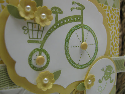
I thought the cute little trike from the Moving Forward set would be a nice fit for this cheerful color combo.  I also found some fun designer paper from Floral District and Pawsatively Prints II to get this card going.  I stamped the trike in Pear Pizzaz, cut it out with a labels die and layered it on a hand cut label.  Sometimes the next size up die is to large for layering on a project, so I traced around the outside of the same die I used on the trike and did some hand cutting.  This makes a nice little layering piece.  I added the punched flowers for a 3-D ellement.  The one below the basket is placed there because of an ink smear.  I was happy to find a way to cover it up!  The little frog layered on punch circles brings a little more whimsy and fun.  The last thing   I did was add some glitter glue to the frog's hop trail, and the trike.  


Make sure you pop on over and visit the blogs of the other design team members!  They have all delivered tons of inspiration!

Here's a list of my supplies.....
Stamps: Moving Forward, Curly Cute
Paper: So Saffron, Pear Pizzaz, White, Floral District DP, Pawsatively Prints II DP
Ink: Pear Pizzaz
Accessories: Pear Pizzaz Ribbon, Itty Bitty flower punch, glitter glue, bird builder punch, labels die, circle punches, modern label punch, pearls

Thanks for taking a peek today!  
Jenny


Friday, January 11, 2013

A Favorite Color Combo

Pink and Navy...one of my all time favorite color combos.  I was sooooo very excited when I saw these were the challenge colors over at Create With Connie and Mary this week!  I also needed a birthday card for one of my very best friends and it just so happens Seize The Birthday challenge blog launches this week with a fun sketch geared toward all things girly.  Perfect!
2012 Create Thursday-014

I started by stamping the main panel in Midnight Muse ink with a stamp from a brand new set of mine from SU called Affection Collection.  I used my labels 3 die from Spellbinders to cut it out.  I also did a little sponging with Pink Pirouette ink around the edge of the die to make a subtle frame.  Then, I ran my brayer over my Illumination ink pad and brayered the shimmery ink right onto the main panel!  I love how this turned out!  I also inked up the Lacy Brocade EF with the same and ran it through the Big Shot.  It gives a little shimmer to the raised background. 


I liked this look so much that I also brayered over the Friend label and the little banner in the corner.  Some pearls, as well as the designer paper and ribbon all work together to finish off my card.


Here's a list of supplies I used....
Stamps: Affection Collection
Paper: White, Midnight Muse, In Color DP, Pink Pirouette
Ink: Midnight Muse, Pink Pirouette, Illuminate
Accessories: Lacy Brocade EF, Pink Pirouette grosgrain ribbon, Midnight Muse satin ribbon, Spellbinders Labels 3 die, Modern Label punch, Pearls

Thanks for taking a peek!
Jenny


Sunday, January 6, 2013

Stylish Sympathy


Boy, oh boy....I have had a time with this post!  Something inexplicably happened to my browse button when trying to upload photos to my blog post.  After much searching for answers and solutions, it was suggested to try posting using Google Chrome. I found that I actually had Google Chrome on my computer which worked.  I usually posted in regular old Google...apparently.  Now, I am not the most computer savvy person on the planet, in fact, I don't know much about them at all.  Most of my learning has come by trial and error.  I was totally panicking when I couldn't post a photo!  Thank goodness I was finally able to figure it out....I think!
Anyway, back to this card.  This one is for a brand new challenge site called Still addINKtive.  The very first challenge combines a color combo and a sketch.
I used my Elements of Style set and played with the spotlight technique.  I neglected to write down the color combo and used Old Olive instead of Wild Wasabi and Pool Party in the place of Baja Breeze.  I knew it was a green and a blue....
I used the little square die from the Apothecary Accents framelits and turned it on it's side to make a diagonal.  I watercolored the images and added pearls to the flowers. The background was embossed with my Lacy Brocade EF and sponged with some Crumb Cake ink.  I added some Vanilla Seam Binding ribbon and a little tag with the sentiment on it.  


Here's a list of my supplies....
Stamps: Elements of Style, Teeny Tiny Wishes
Paper: Pool Party, Sahara Sand, Perfect Plum, White
Ink: Pool Party, Old Olive, Perfect Plum, Crumb Cake
Accessories: Vanilla Seam Binding ribbon, Pearls, Apothecary Accent die, Tiny Tag punch, Lacy Brocade EF, Linen thread

Thanks for taking a peek!
Jenny


Saturday, January 5, 2013

Island drinks ~ DD34 & MOJO274

 
Good Saturday morning everyone and welcome back to Dynamic Duos Challenges!  We've had a nice little break for the Holidays, but now it's time to get our stamp on again!  This week the colors are super fun and really said "let's go have a drink on some beach some where and then go dancing" to me!  I was definitely inspired to pull out my Happy Hour set and get going!  I also used the sketch from Mojo Monday and flipped it on it's side.  I added a little bit of glitter to the drink, umbrella and strawberry.


My post is very, very late today, but I'm having some issues with Blogger.  It's a miracle that I got this one picture posted.  I have a couple other pictures to post of this card, but I don't think it's gonna happen.  I hope the problem resolves itself before my next post!  It's so frustrating when things don't go the way you want them to! 
Here's a list of my supplies:
Stamps: Happy Hour
Paper: Melon Mambo, Island Indigo, White
Ink: Melon Mambo, Island Indigo, Pool Party
Accessories: Dazzling Diamonds, White Grosgrain ribbon, Melon Mambo Pom Pom trim, Big Designer Button, Circle cutting system from Creative Memories, Fancy Fan EF

Thanks for taking a peek and have a wonderful day!
Jenny